Updated October 2026
15 Wedding Monogram Fonts That Look Expensive
Wedding Font Lab · Monograms
Quick answer
Short on time? Merlina Darling gives you that classic linked-initials look, Wedding Calligraphy is the most formal and expensive-reading of the list, and the Best Wedding Calligraphy Font Bundle hands you 25 monogram-friendly styles for one low price.
One tip before you scroll: test your actual initials together. An M next to a W connects differently than A plus V — every font below behaves a little differently once real letters meet.
We curate wedding fonts full-time and test every pick on real invitation suites — learn more about us. Some links below are affiliate links, which keeps this site free.
A monogram is the smallest design decision with the biggest presence. Two or three letters appear on your napkins, your dance floor, your wax seals, your cake topper — and because there is nowhere to hide, the font has to carry the whole look. Pick wrong, and even gold foil reads cheap. Pick right, and plain card stock suddenly looks custom.
The fifteen fonts below were chosen for exactly one job: making initials look expensive. Some do it with linked strokes, some with formal flourishes, some with sheer variety. Every one comes from Creative Fabrica, where an All-Access subscription covers commercial use — which matters if you plan to sell monogrammed designs, not just print them for your own table.
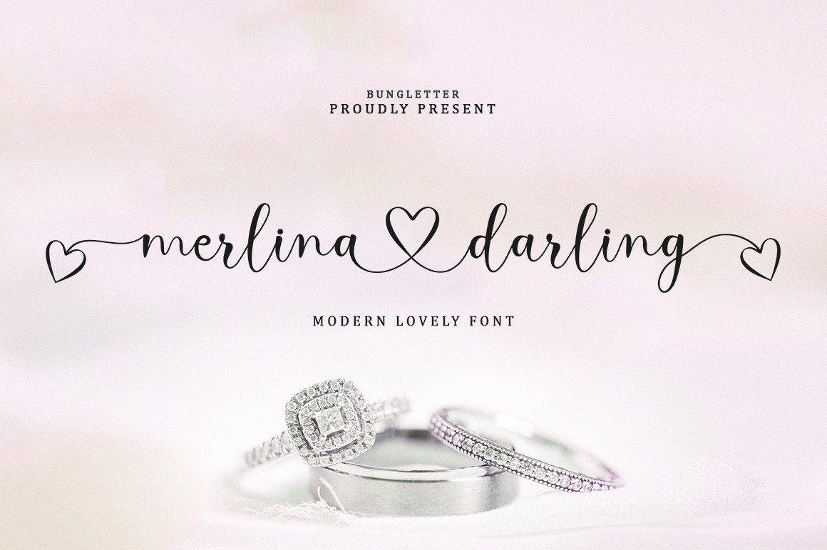
The linked middle strokes make joined initials read as one crest — exactly what a monogram wants. Best look: two large letters overlapping on napkins, invitation corners and cake toppers. The premium, connected flow is why this one opens the list.
View on Creative Fabrica →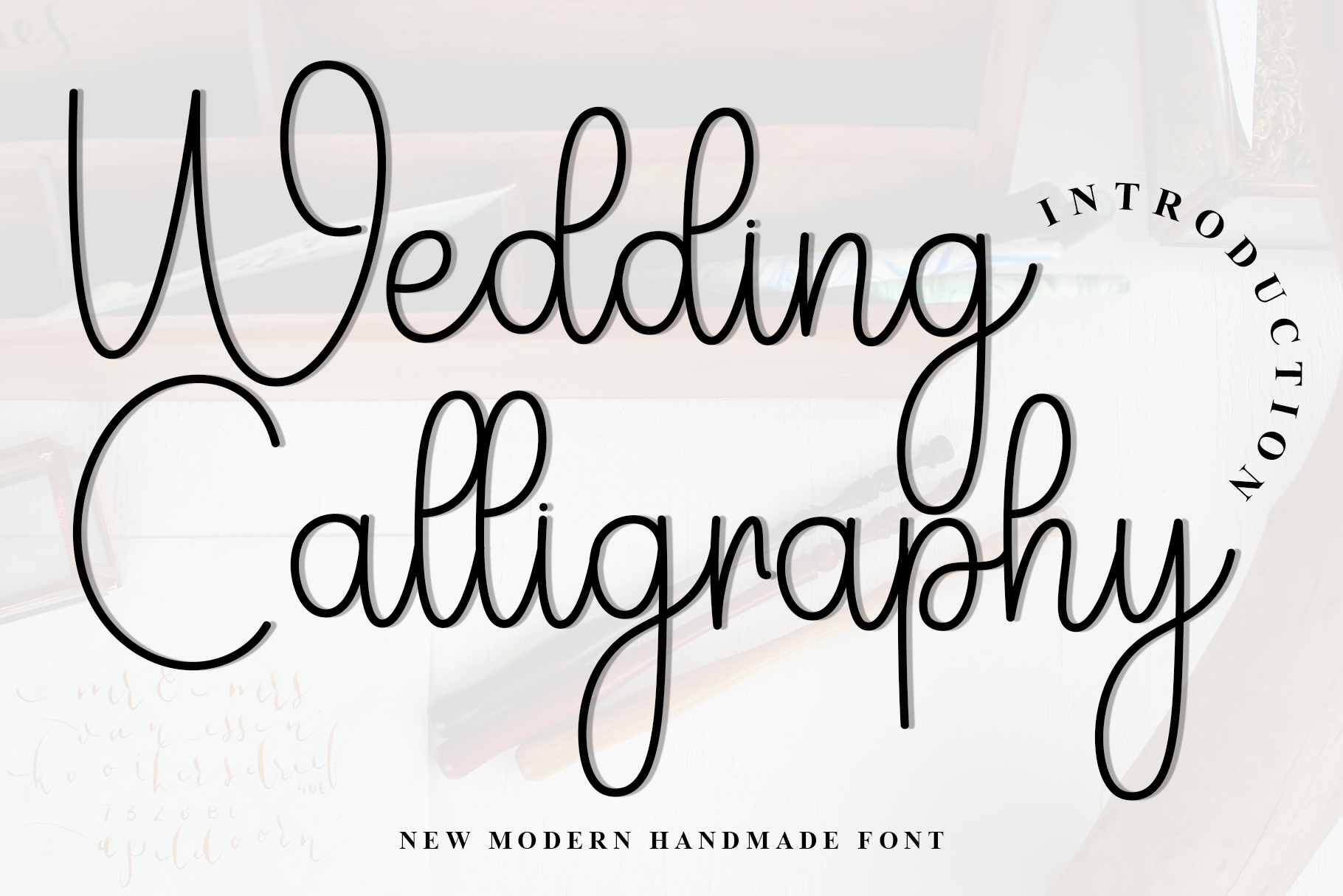
Formal, precise and engraved-looking — this is the font that makes black-tie monograms read expensive at first glance. Strongest on wax seals, place cards and anything printed small, where its disciplined flourishes stay crisp instead of turning to mush.
View on Creative Fabrica →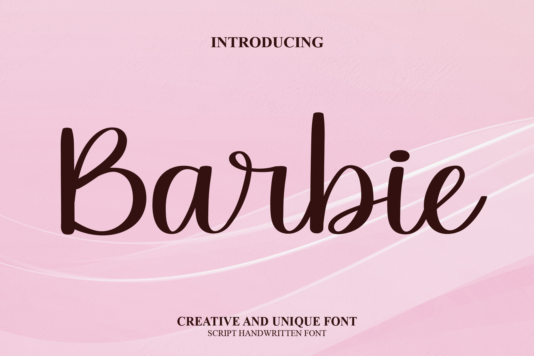
Gorgeous glyphs and smooth curves give single initials a fairy-tale finish. It is the most versatile script here: big and dramatic on a dance-floor decal, still graceful at invitation size. Just watch the long swashes when letters sit close together.
View on Creative Fabrica →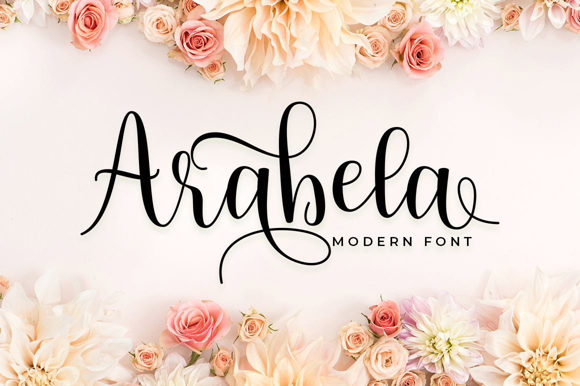
Refined swashes that frame initials like jewelry. Arabela works especially well for single-letter monograms inside wreaths and round frames — the flourish ends fill the space so the composition never looks empty. PUA encoded, so alternate glyphs are easy to reach.
View on Creative Fabrica →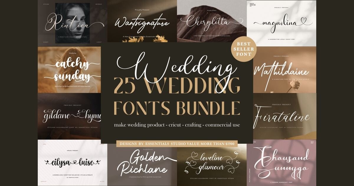
Twenty-five calligraphy fonts in one download, from formal hands to relaxed modern styles — effectively a monogram wardrobe. When a client wants three options by tomorrow, this is the shortcut. The All-Access license covers selling monogrammed designs, too.
View on Creative Fabrica →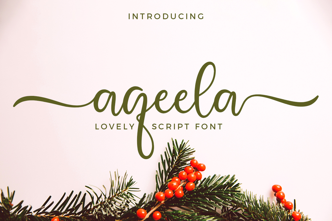
Balanced curves that stay legible at small sizes — the quiet achiever for embroidered napkins, ribbon prints and favor tags. If your monogram will live mostly under 5 cm tall, this is the safer script than anything overly ornate on this list.
View on Creative Fabrica →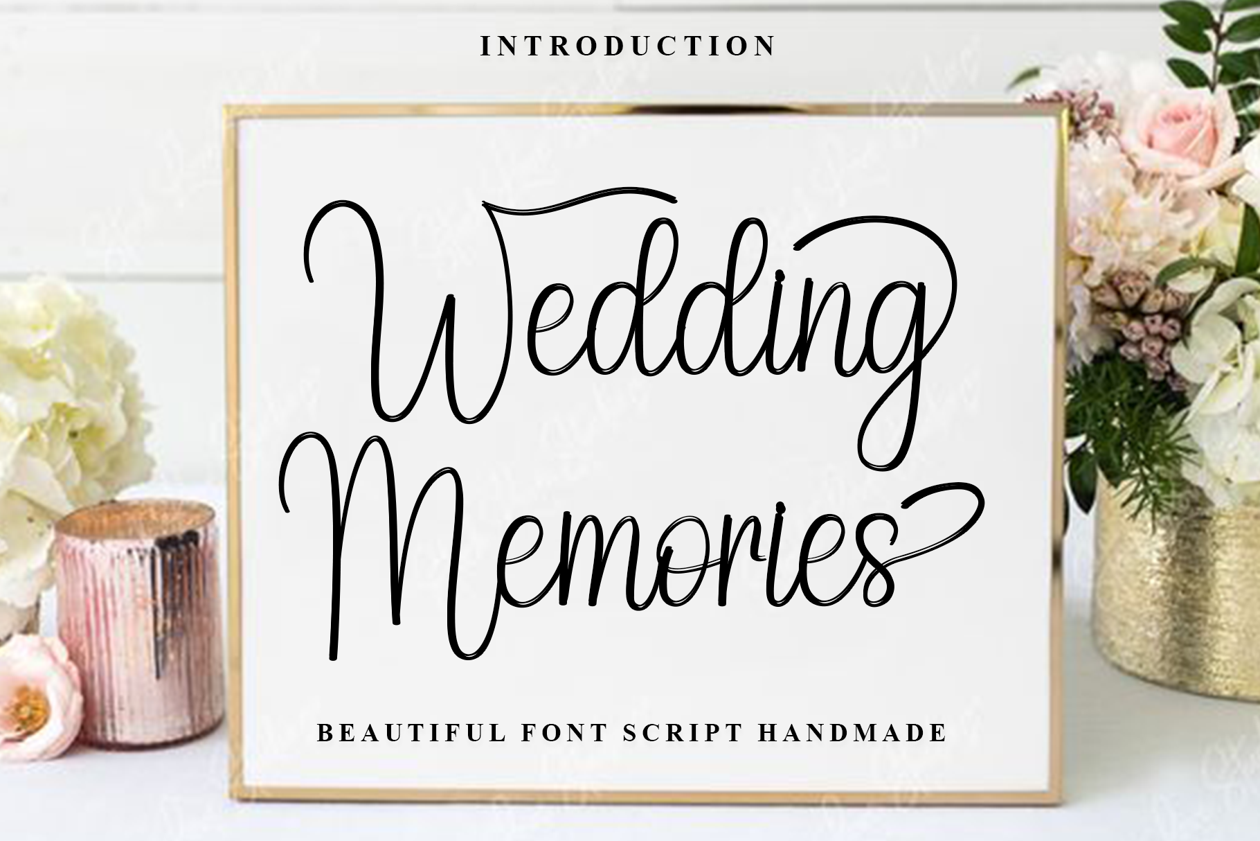
A clean, polished contemporary script that photographs beautifully — which matters, because modern monograms often appear on dance floors, photo backdrops and social-media saves. Crisp shapes hold up under stage lighting and camera compression alike.
View on Creative Fabrica →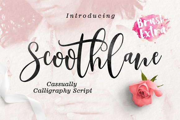
Soft letters packed with gentle swashes, made for romantic monogram moments: welcome-sign corners, dessert-table cards, linen prints. The flourishes are expressive without stealing attention from the initials themselves.
View on Creative Fabrica →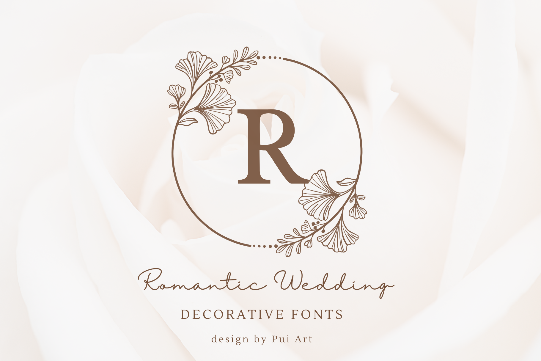
Expressive, emotional strokes that suit keepsake monograms: handkerchiefs, vow-book covers, anniversary prints. It reads personal rather than corporate — pick it when the monogram should feel like handwriting, not a logo.
View on Creative Fabrica →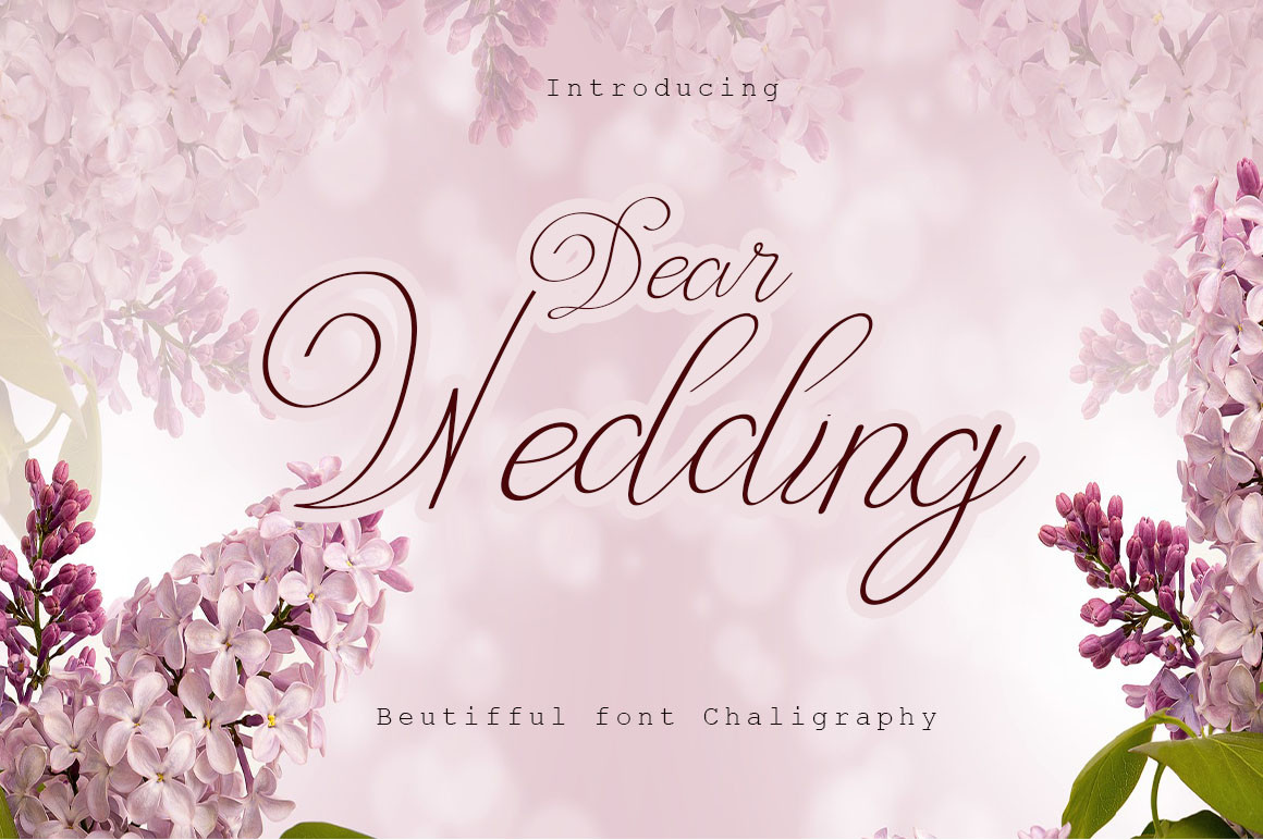
Delicate and intimate, with a note-to-a-friend quality. Lovely for two-letter monograms on place cards and small stationery, where its gentle charm beats heavy formality. Less suited to huge signage, where thin strokes can fade.
View on Creative Fabrica →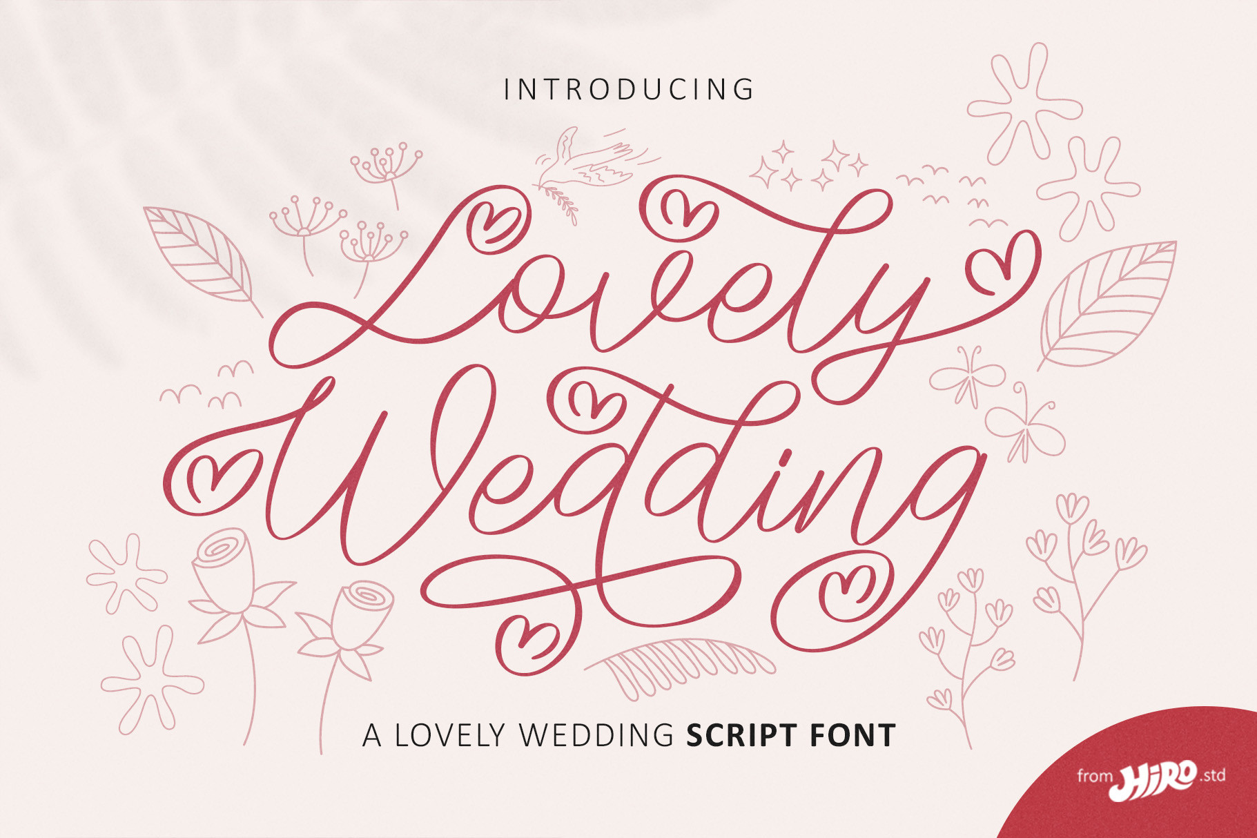
Tender, classic letterforms that flatter traditional three-letter monograms. The rhythm is even and predictable, which helps when your initials include tricky pairs like Y and J. A dependable pick for invitation corners and envelope flaps.
View on Creative Fabrica →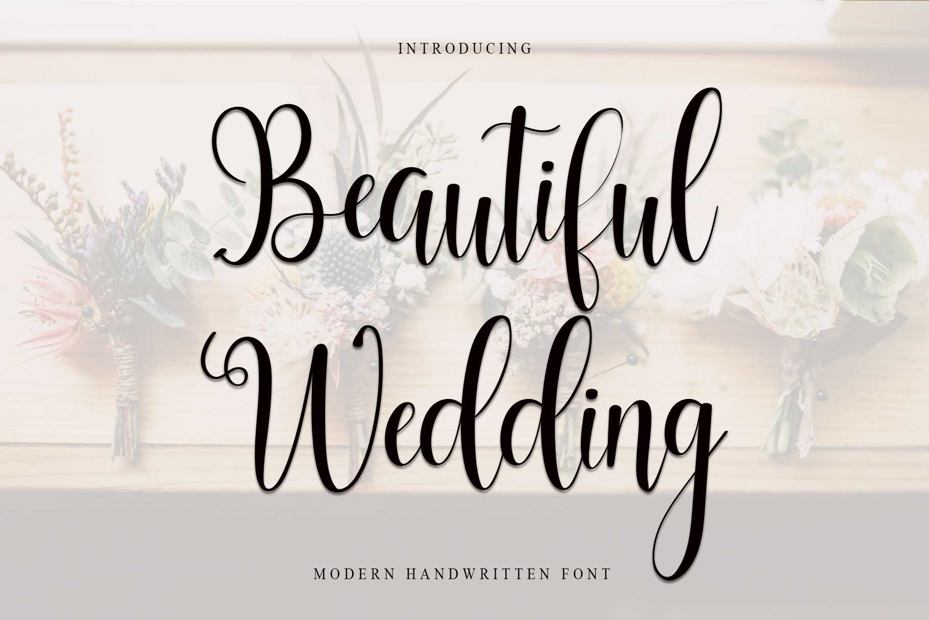
Well-balanced shapes that keep the whole composition harmonious — the font for couples who want elegant without drama. A strong choice for seating charts and program headers that carry the monogram alongside longer text.
View on Creative Fabrica →Manda
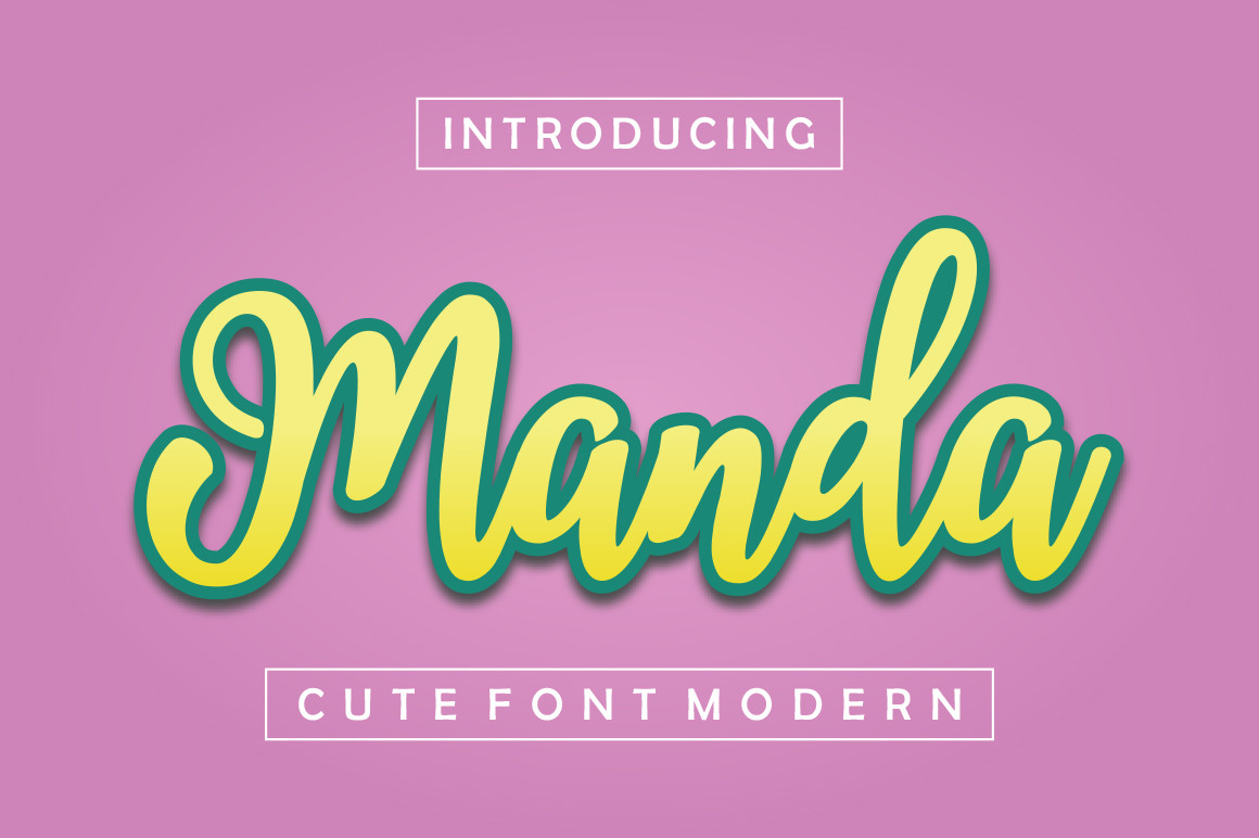
Natural, hand-lettered strokes that make standard initials feel one of a kind. It suits garden and estate weddings where the monogram should look penned, not typed. Test the connecting strokes between your specific letters before committing.
View on Creative Fabrica →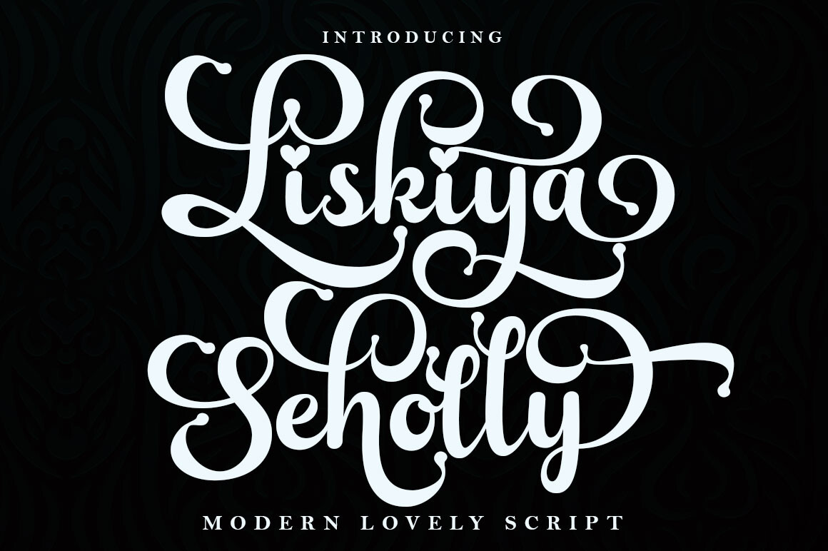
Casual, flowing modern calligraphy with a logo-design pedigree — which is what a monogram effectively is. Fresh and contemporary on cocktail napkins, stickers and hashtag cards; relaxed enough for beach and destination celebrations.
View on Creative Fabrica →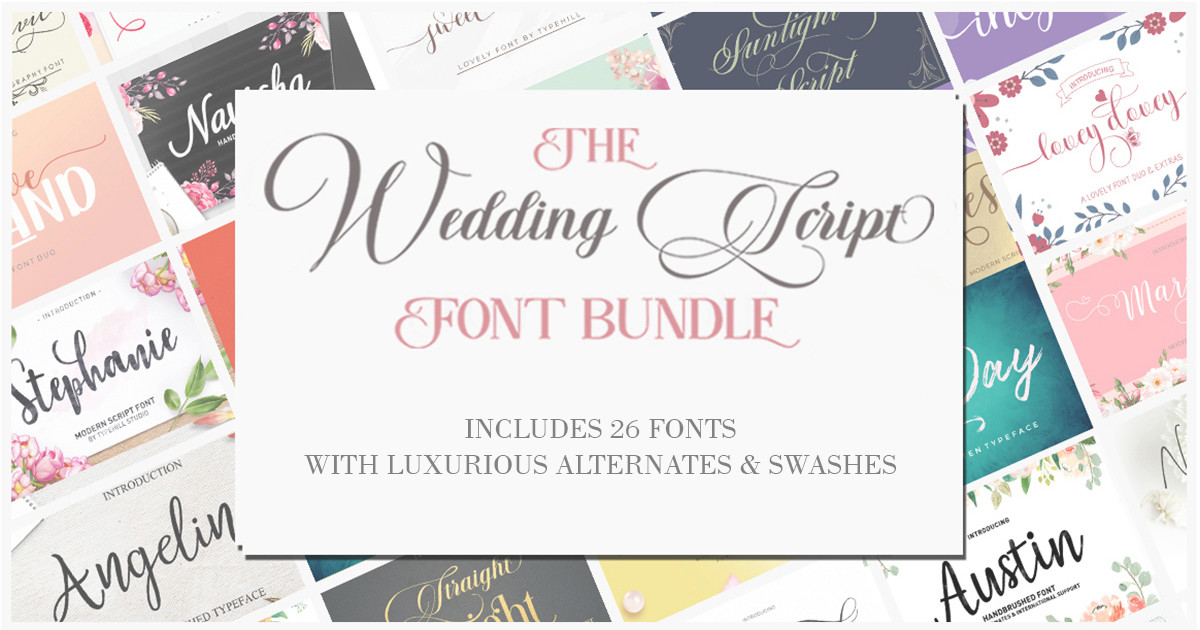
Fifty-seven fonts in one purchase — the widest monogram experiment field on this list. Mix styles across your suite so napkins, signage and favors feel coordinated but not cloned. The cheapest way to try many looks before choosing a favorite.
View on Creative Fabrica →Wedding Fonts — FAQ
What makes a font look expensive for monograms?
Three things: controlled flourishes (decorations that frame letters instead of swallowing them), even stroke rhythm, and how gracefully the letters connect. Cheap-looking monograms usually fail on spacing — the initials collide or float apart. Every font above handles spacing gracefully, but always test your real initials before printing anything.
What is the correct order for wedding monogram initials?
The traditional format is bride's first initial, the shared last name initial (largest, in the middle), then groom's first initial. For a two-letter monogram, many couples use first initials only. And honestly, a single last-name initial is a perfectly modern route — it also sidesteps tricky letter pairs completely.
Which monogram fonts work for Cricut and Silhouette projects?
All of them. Download the font, install it on your computer, and it appears in Cricut Design Space, Silhouette Studio and any design app that reads TTF/OTF files. For layered vinyl or iron-on projects, scripts with thicker strokes like Merlina Darling or Aqeela weed far more easily than hairline flourishes.
Can I sell products with these monogram fonts?
Yes, provided your license covers commercial use. The fonts here come from Creative Fabrica, and an All-Access subscription includes a commercial license for finished products — napkins, signs, templates you sell. Standard monogram merchandise is squarely covered, though it never hurts to check the individual font page for unusual cases.
Script or serif for a monogram?
Scripts dominate wedding monograms because initials alone can carry all the decoration. A serif monogram looks more architectural and modern — a great route for minimalist celebrations — but it needs stronger layout support around it. If your suite already runs on clean geometry, a serif monogram will fit it better than another swash.